It’s all about the font
Palatino, Zapfino, Avenier, Bangla … No these are not cites of the world; they are a part of the world of Typography.
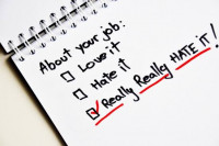
Let’s be honest with ourselves, the right font counts when it comes to presenting your resume.
The days of Times New Roman dominating the Microsoft Word market is over. Even Microsoft has downgraded this well-known default font back to the general menu.
Employers are looking at every detail on your resume, so make sure to use a font that will present you in a professional manner. Here are some examples of the good, the bad and the down right stupid.
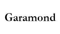
Garamond is the modern classic. It’s perfect for a resume that needs to fit all of your work experience on a single page, its clear, concise and most importantly it’s easy to read.
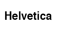
Helvetica is the current king of the font world when it comes resume writing. It is one of the most commonly used fonts and is welcomed by employers as a chic, modern and risk free. When applying for any role, this should be the font of choice
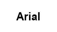
Arial is one of the current default fonts. According to the Huffington post "It's clean but doesn't have much of a way about it." So when in doubt use this font for a clean finish and a professional look.

Times New Roman used to be the go to font when Microsoft Word was first developed. Now it’s known as the lazy font. According to an article published in Bloomberg Business “ [Using Times New Roman is] telegraphing that you didn’t put any thought into the typeface that you selected… It’s like putting on sweatpants.”
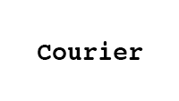
Only if you were applying for a job in 1960’s would you even consider using Courier. If it reminds you of a time before computers were in existence. That’s where it belongs.

Obviously if you want to look professional and get the job, this is not the font to use! If you are creating a comedy night poster then feel free to use this.
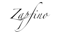
Lastly save this for the next restaurant menu you design.
Back